This location has always had a bit of a tug on my memory strings, for more than one reason, one very good, one nearly very bad! It was here on my first photo workshop with Nick Jenkins that the penny dropped for me on how to compose an image, rather than just take a picture. It was also the spot that a fellow workshop-attendee nearly tipped me into Stainforth Force with all my gear, tripod and all – it would have been a very clumsy accident. If he’d succeeded there would never have been any “Moments like these”!!
So when I had the opportunity to re-visit Stainforth Force in the Ribble Valley, I thought it would be a good exercise to see how my new camera and lenses, coupled with my improved Lightroom skills (hopefully) could handle the same composition that I’d liked so much, 8 years previously.

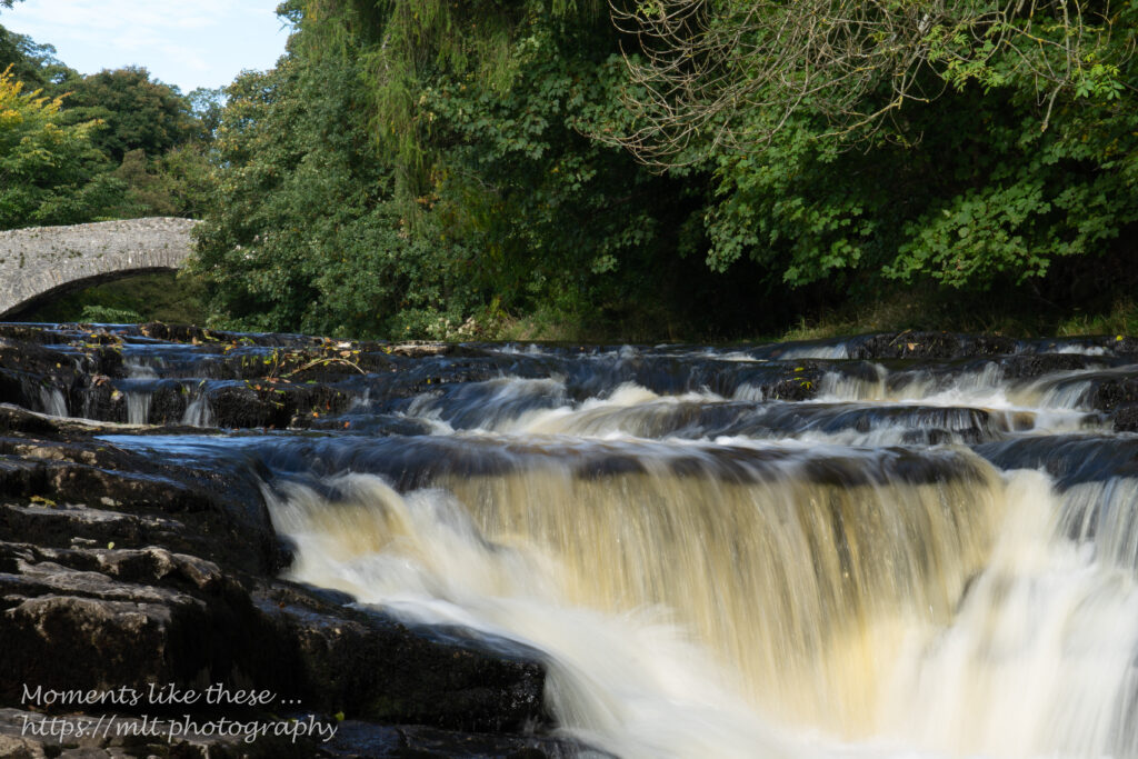
Above is the shot I took, straight out of the camera and “pin-sharp” (Sony A7r) this October. [7360x4912px, cropped to 5466x3648px, to match the 2010 image].[EXIF details 1/8sec @ f22, ISO 50, Sony FE24-105 F4 G OSS lens @ Focal Length 57mm]

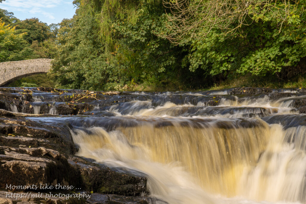
After processing in Lightroom Classic CC – White Balance set to Cloudy, Auto tone chosen (thought I’d test how good that would be, and also thought it would be an interesting base-line comparison to the earlier shot) with a little increase in the Vibrance (from +13 to +18) and Saturation (from -2 to +4), and Clarity (+18) added, I got the shot above which I think is quite nice.


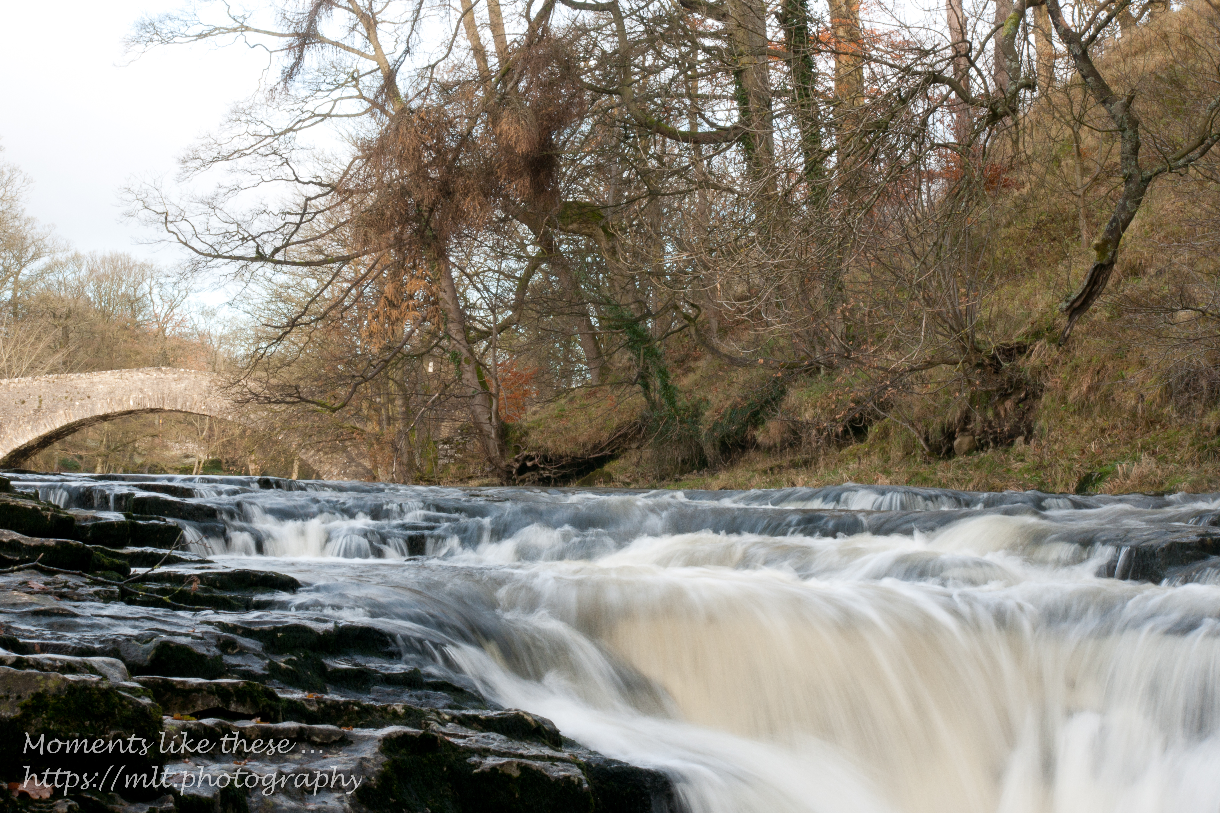
However the shot above is how I did process the image, dragging down the Highlights to get some blue sky and accentuating the autumn colours with high Vibrance and Saturation values. Doing this turned a flat image into one that has always been one of my favourites.
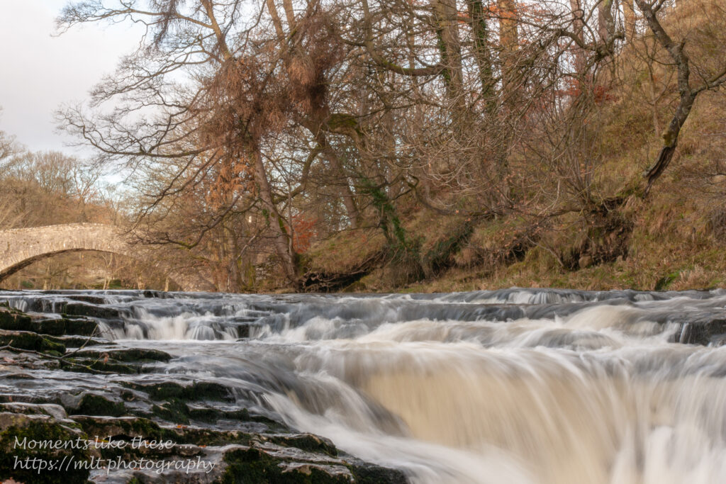
Is one better than the other? Probably not – they’re different. The 2018 image is sharper reflecting the better camera sensor and lens. The techniques used were virtually identical. The post-processing is the difference between the two images, the 2018 image really couldn’t take too much alteration otherwise it would have looked false, so it was the post-processing (and the season) that maked the earlier image stand-out and still remain one of my favourites. Do you agree?

Pretty impressive ! Beautiful scenery.
Thanks Jan, it is a lovely spot. I re-visited it with a sense of whether there was any chance of deja-vu, and being by myself just a little bit worried that the Force was not going to be with me!! But all was well, and I survived to tell the tale!
It’s very beautiful. And best taken from the safety of dry land!! ?
Indeed!
I prefer the earlier shot, David, partly because more of the bridge is visible, and partly because the green foliage in the later one is too prominent for my taste. I like the slightly higher viewpoint though.
It’s an interesting one Jim. I tend to agree with you, but the truth of the matter is that the more recent one has far less Lightroom intervention and the resolution is so much better. Amazing the difference in the lens and sensor if you zoom in close. But as you say the overwhelming green detracts from the image, and the autumn colours really make the shot, thus telling evidence that season is a very important component in composition, as is light of course – which was far better in the later shot, but which I was able to enhance (RAW image) by changing the highlights quite a bit!